Designer Behind Pokémon's Iconic Logo Revealed
- By Allison
- May 23,2025
When you receive an unexpected call from the president of Nintendo of America, it's wise not to ask too many questions—just answer the call. This was the advice given to designer Chris Maple by a fellow designer back in 1998, who predicted the call would come later that day. At the time, Maple was accustomed to receiving sudden calls from company executives, as his design business, Media Design, specialized in handling last-minute projects for companies in urgent situations. Although rarely credited publicly, Media Design built a solid reputation in the Seattle area, working with clients like Boeing, the Seattle Mariners, and Holland America Line cruises.
Maple's business had been running for several years when he received a call from the secretary of then-Nintendo of America president Minoru Arakawa, inviting him to visit their Redmond office. The only detail shared was that Nintendo wanted him to work on a new game. Intrigued, Maple accepted, unaware that he was about to play a key role in one of the world's biggest cultural phenomena: Pokémon.
Go West, Pocket Monsters
Upon arriving at Nintendo of America's headquarters, Maple spent half an hour in the lobby, captivated by a striking 21-inch crystal horse head. "You get a sensation. Like I'd have to read a room when I go into these corporate arenas, since I'm the subjective person presenting the aspect of imagery and content behind whatever's bothering them that day or what's broken or what needs to be fixed," Maple explained. Eventually, he was escorted to a meeting room where he met Arakawa, whose magnetic personality left a strong impression.
Arakawa introduced the project, explaining that Nintendo was set to launch a game in the United States and Europe but had struggled with previous agencies, burning through both budget and time. "Are you okay with that?" Arakawa asked. Maple confidently replied, "Yeah, sure. It's going to cost a penny."
A woman then entered with a cardboard box, spilling out toys, paper, and drawings on the table. When Maple asked what it was, Arakawa replied, "It's a Pocket Monster. It's Pokémon. We're going to call it Pokémon."
Maple was tasked with creating a new logo for Pokémon, which at the time was known in Japan as Pocket Monsters Red and Green. Nintendo planned to release the game in the West as Pokémon Red and Blue, followed by the Yellow Pikachu Edition. They needed a new logo to rebrand from "Pocket Monsters" to "Pokémon" and gave Maple just one month to complete it, with no specific instructions on the design.
The Mystery of the Missing Crystal Horse Head
In my recent online search, I tried to track down the crystal horse head that Maple vividly remembers from Nintendo's lobby. This piece of decor left a lasting impression on him, subtly influencing his design of the now-iconic Pokémon logo. Despite my efforts, I couldn't find any trace of it online or in old videos of Nintendo's lobby, which has since been replaced by a tennis court. Former employees and regular visitors from that era don't recall a horse head, suggesting Maple might have entered through a different lobby. Nintendo did not respond to my inquiries, and The Pokémon Company, which did not exist in its current form in 1998, couldn't help either. Other industry veterans and institutions like DigiPen and The Video Game History Foundation also had no information on the horse head.
Update 7:21 a.m. PT: Shortly after publishing this piece, I received a tip about a reference to the horse head in David Sheff's book "Game Over." On page 198, the book mentions, "In the lobby of NOA’s headquarters is a smoky glass coffee table and a crystal horse’s head in a glass case." I've reached out to Sheff for more details or photos.
If you have any information or photos of this mysterious crystal horse head, please contact me at [email protected].
Attaching Energy
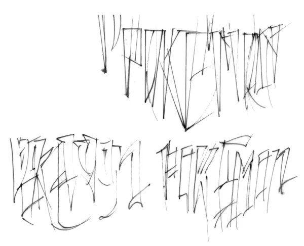
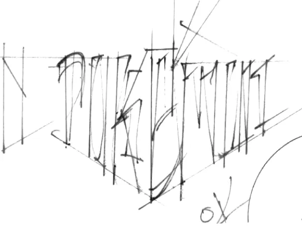
Typically, designing a logo like this would take about six months, involving multiple revisions. However, Nintendo's one-month deadline was critical for the upcoming E3 1998 unveiling of Pokémon Red and Blue. Used to working under tight deadlines, Maple began sketching various Pokémon logos by hand on a light table, experimenting with different letter shapes. He created several variations to present to Nintendo.
Original Pokemon Logo Sketches by Chris Maple
 View 8 Images
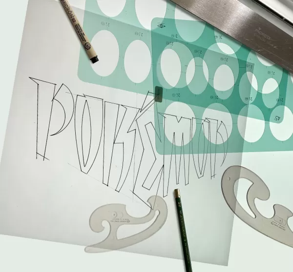
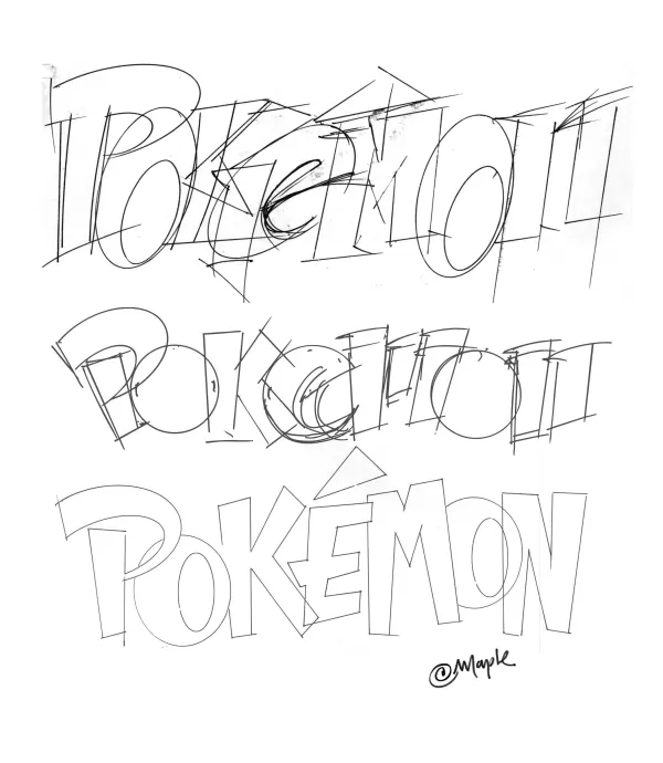
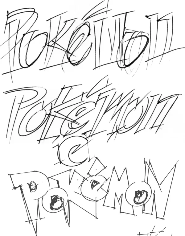
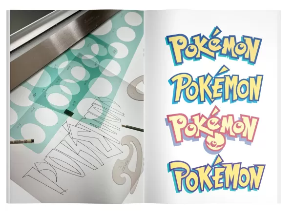 With limited information and no access to the games, Maple relied on the materials provided: paper, toys, and a small Pikachu figurine. Nintendo briefly explained the game and showed him some monster illustrations and an early version of Nintendo Power magazine, which would later feature the logo's debut. The logo needed to be suitable for the GameBoy's small, pixelated screen and work in both color and black and white.
Maple presented his logo variations to Nintendo, starting with those he was less enthusiastic about. The response was lukewarm until he showed his favorite. The room fell silent until Don James, former Nintendo of America executive VP of operations, declared, "I believe this is the one." Arakawa and others agreed, and Maple was instructed to produce it.
Maple attributes his choice to the "energy" in the logo and his attempt to capture the story and potential of Pokémon. The final color scheme of yellow and blue, he says, just felt right, possibly influenced by the names of the games being released in the West.
Once the logo was finalized, Maple was mostly removed from the project as Nintendo focused on marketing and releasing the games. A few months later, he visited Toys R Us with his son and was amazed to see a massive Pokémon display featuring his logo.
Pokémon Forever
Maple's involvement with Nintendo and Pokémon didn't end there. After E3, Arakawa asked him to make minor adjustments to the logo, which resulted in the version we know today. Maple also worked on other projects for Nintendo, including games like Major League Baseball Featuring Ken Griffey Jr., Mischief Makers, and a Star Wars game, as well as redesigning the Nintendo 64 box for the Atomic Purple release.
 The first final version of the Pokémon logo Maple submitted, prior to the adjustments he made to the P and E.
 The Pokémon logo with Maple's adjustments, as we know it today. Maple played the Pokémon games briefly but was too busy to delve deeper. His son collected the trading cards until they were banned at school. Maple's daughter proudly shared his role in creating the logo with others.
As Nintendo began hiring more in-house artists, Maple's work with them tapered off. For years, he kept his role in designing the Pokémon logo private, as it was common in his industry not to credit individual logo designers. Recently, encouraged by his son, Maple began discussing his work publicly and showcasing it on his website, along with new T-shirt designs and other images.
When asked what he might do differently now, Maple suggested he would revert to the original 1998 logo before Arakawa's adjustments. He also expressed a desire to be involved if Pokémon celebrates its 30th anniversary, emphasizing the importance of preserving the logo's foundational energy.
Maple feels a sense of responsibility and pride in his contribution to Pokémon's success, especially seeing how it has impacted children and fans worldwide. He continues to teach children in challenged areas, where his connection to Pokémon often excites his students. "Some of the experiences you get are just priceless. But I'm just happy that it's doing well…Yeah, I love it, and that's why I work still today," he says.
Latest News
more >-
-

- Universal Piece Trello and Wiki Links
- Oct 22,2026
-

-
-