Is Civ 7's UI as Bad as They Say?
- By Amelia
- Feb 20,2025
Is Civilization VII's UI Really That Bad? A Critical Assessment

Civilization VII's Deluxe Edition launched recently, and online discussions are rife with criticism of its user interface (UI). But is the negativity justified? Let's analyze the UI's strengths and weaknesses to determine if the internet's assessment is accurate.
← Return to Sid Meier's Civilization VII main article
Dissecting the UI: Meeting 4X Standards
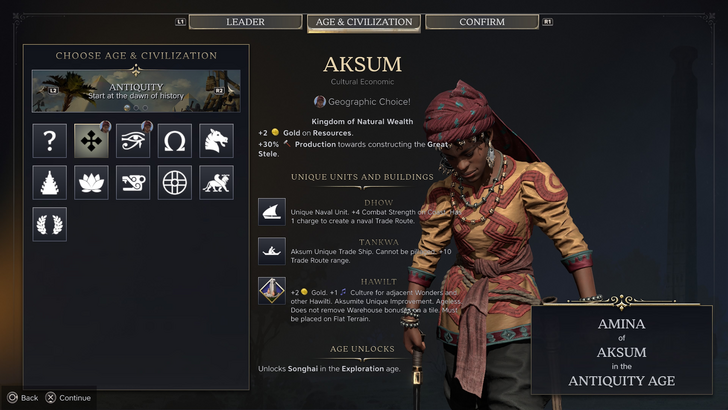
Early opinions paint a negative picture of Civ VII's UI, citing missing quality-of-life features. However, a thorough examination is needed to determine if the criticism is warranted. We'll evaluate the UI against key elements of effective 4X game interfaces.
Defining a Successful 4X UI
While objective UI design principles exist, the ideal 4X UI is context-dependent. Game style and goals influence design choices. However, common elements contribute to successful UIs across various 4X games. Let's use these elements to assess Civ VII.
Information Hierarchy: Clarity and Accessibility
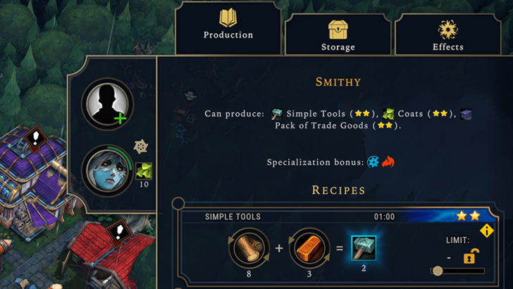
Effective information hierarchy prioritizes important gameplay data. Frequently used resources and mechanics should be prominent, while less critical elements remain easily accessible. Against the Storm's building info menus serve as a positive example, using tabs to organize information by relevance and frequency of use.
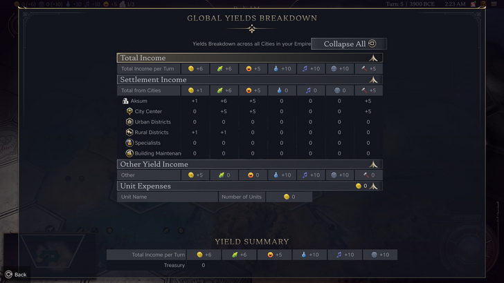
Civ VII's resource summary menu displays resource allocation, separating data into income, yields, and expenses. While well-structured and collapsible, it lacks granular detail. Specific district or hex-level resource generation isn't shown, and expense breakdowns are limited. The UI functions adequately but could benefit from increased specificity.
Visual Indicators: Efficiency and Impact
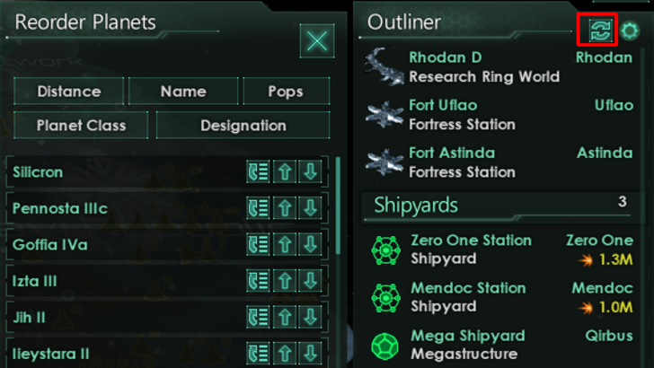
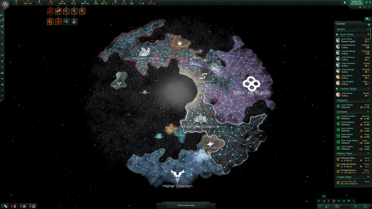
Effective visual indicators convey information quickly using icons and graphics. Stellaris' Outliner, despite a cluttered main UI, showcases strong visual indicators for ship status and colony needs.
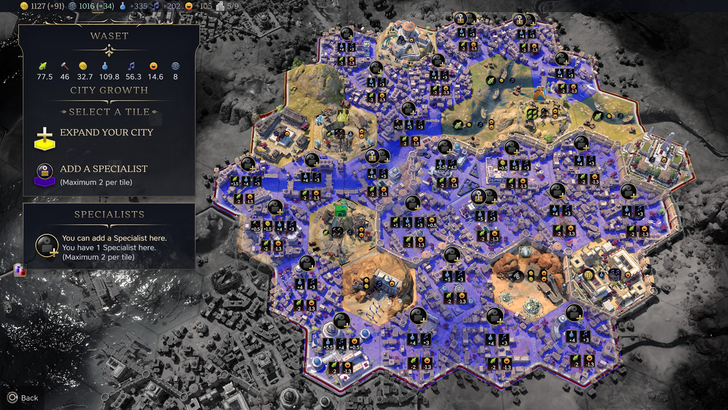
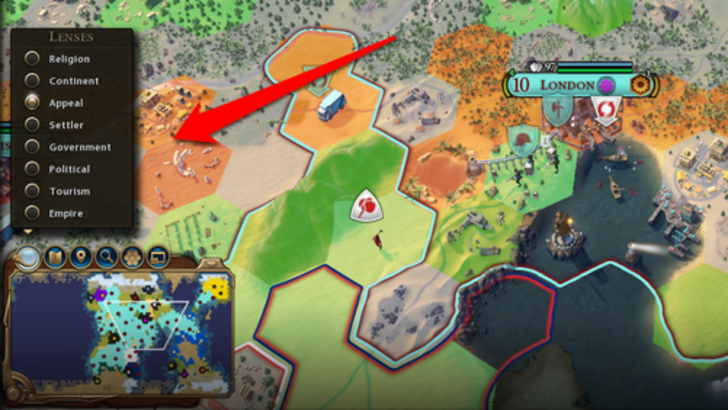
Civ VII utilizes iconography and numerical data for resources, but some effective visual indicators are present. Tile yield overlays, settlement overlays, and settlement expansion screens provide useful visual information. However, the absence of certain map lenses from Civ VI (e.g., appeal, tourism, loyalty) and customizable map pins has drawn criticism. While not terrible, improvement is possible.
Search, Filtering, and Sorting: Streamlining Navigation
In complex 4X games, search, filtering, and sorting are crucial for managing information overload. Civ VI's robust search function allows players to locate specific elements on the map. Its Civilopedia also links entries to in-game instances.
Civ VII lacks this vital search function, a significant drawback for many players. The absence impacts usability, especially given the game's scale. This is a considerable area for improvement.
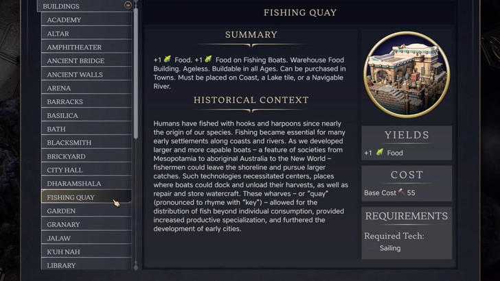
Design and Visual Consistency: Aesthetic Appeal and Cohesion
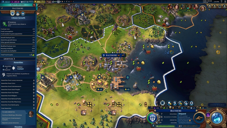
UI aesthetics and cohesiveness significantly impact player experience. Civ VI's dynamic, cartographical style seamlessly integrates with the game's overall aesthetic.
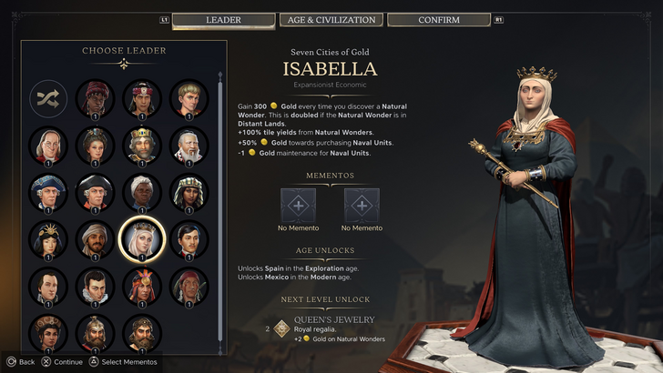
Civ VII adopts a minimalist, sleek design, prioritizing refinement over vibrancy. While not visually unappealing, its subtler thematic direction may not resonate with all players. The visual design is subjective, leading to mixed reactions.
The Verdict: Not as Bad as Advertised
Civ VII's UI, while not perfect, isn't as disastrous as some claim. Key features are missing, particularly the search function, but this isn't game-breaking. Compared to other issues, the UI's flaws seem less significant. While it lacks the visual appeal of some competitors, its strengths should be acknowledged. Future updates and player feedback can address its weaknesses. The overall game experience compensates for the UI's imperfections.
← Return to Sid Meier's Civilization VII main article
Sid Meier's Civilization VII Similar Games

Latest News
more >-

- Universal Piece Trello and Wiki Links
- Oct 22,2026
-

-

-

-